Happy belated new year! This year, Nails by Mets’ is celebrating SEVEN years in business and to celebrate this amazing achievement, we have refreshed the logo to better fit our brand.
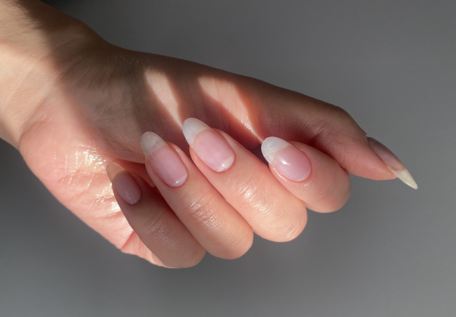
Nails by Mets founder, Metta Francis says, “the logo is now a deeper purple and we’ve moved away from the burgundy tone. There were a few options that I sampled with clients and this one was the clear winner, mainly because it had the biggest impact. It’s bolder and more sophisticated. I wanted the new logo to illustrate our nail art capabilities and the half moon manicure does just that, but in a very classic way. I didn’t want the logo to be too trend led because we’d end up with a dated looking logo by the end of the year. I absolutely love it!”
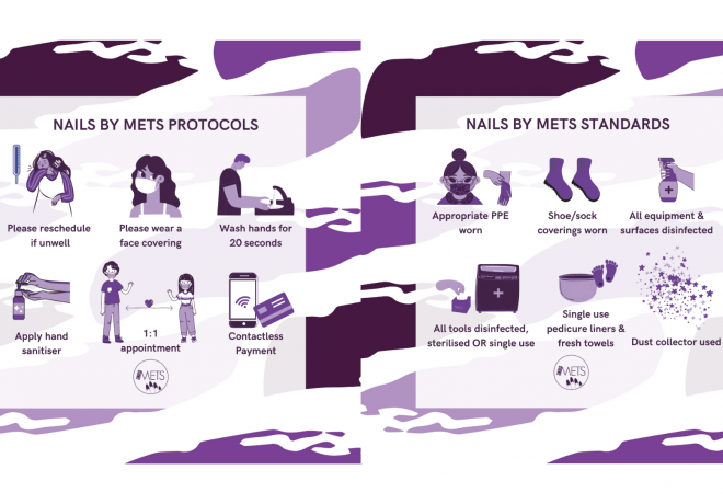
Over the next few weeks, we’ll be rolling out more branding changes and you’ll notice the website, Instagram, Facebook and Twitter pages slowly updating. Let us know what you think about the new logo and branding!
With thanks to Nails by Mets creative designer, Abi Wright.
 BOOK NOW
 07539393225